Screenshots are preferred. Print screen is a more cumbersome and less reliable approach. The difference between those is only slight, but it certainly exists. As others have said, the print screen image comes out slightly darker all over. It's the kind of thing we *could* fix with a brightness filter, but that's not the DKC Atlas way. Unless we can be sure it's pixel-perfect... it's not finished. Of course, even an off-colour layout is still valuable as a guide. Most of my finished map terrain is extracted directly from savestates, not from screenshots at all. These two techniques match up perfectly together though, so don't worry - consistency and precision is kept in check.
Okay, I've got a few techniques I'd like to have opinions on.
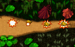
Hidden banana indicatorsFirstly, I'm liking the idea of indicating the locations of hidden banana bunches. The way I plan to have the on-site maps displayed will allow things like this to be displayed optionally, and I'll have them 'off' by default. Those who saw my original Jungle Hijinxs map will remember that I had then displayed the left-most graphic as the indicator, but I've toyed with some variations...

- Hidden banana bunch indicators (possible techniques)
- jh-map-snip4.png (29.01 KiB) Viewed 206962 times
Having the banana bunch as part of the indicator graphic seems like a good idea, as it helps clarify the meaning of the mark. I like the idea of using the starburst as an indicator, as it is seen when the bananas are uncovered, and is in the exact same place each time, so it feels highly accurate and appropriate to me. Any other suggestions are welcome, though.
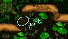
Bonus entrance labelsMarking bonus room entrances - be they barrels or tunnels - is a must for these maps... but how should it be done? I actually hand drew/wrote this label, and edited it digitally to make it look a little nicer and fit the map's style a bit better.

- Bonus area entrance indicator
- jh-map-snip3.png (27.94 KiB) Viewed 206961 times
I'm not all that sure though, I'd rather use in-game graphics as much as possible for this sort of thing. I'm thinking it would work well to have
#1,
#2 etc typed next to that label to indicate the first bonus, second bonus, etc. per level. Comments on this technique/idea would be great, cheers.
Level info/disclaimer textThis is the current formatting for the level info, credit, copyright etc. text tag which I'll attach to each map:

- Level/map information text
- jh-map-snip2.png (25.08 KiB) Viewed 206960 times
I will probably try other fonts/formatting/info/layouts, but for now I like this look. Comments, please!
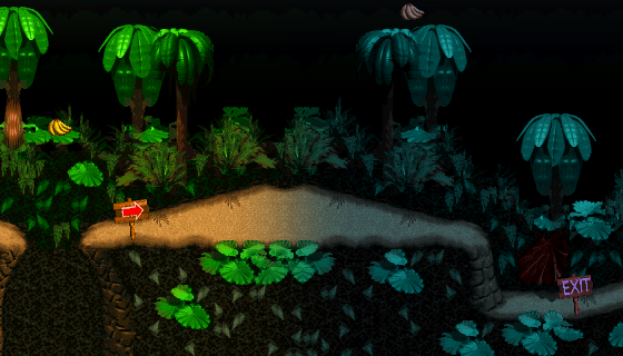
Jungle 'night' effectLastly, any feedback on the 'night' effect would be appreciated.

- Night effect at level's end
- jh-map-snip1.png (121.79 KiB) Viewed 206960 times
I'm not sure if this is a good idea or not, but it provides information and (in my opinion) looks nice, so I'm rather happy with it.
Any comments and suggestions are awesome, so unleash your inner critic!


