Good find, cfh.
The Rare logo is also very obviously a stylistic 'R', and the
crescent shape doesn't mean anything. As far as I can see, they are entirely the same logo.
From the
company website:

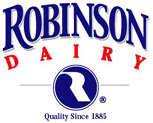
- Robinson Dairy Logo
- logo1.jpg (18.96 KiB) Viewed 65607 times
The so called 'crescent' is really a circle to encompass the obviously Rare-like logo.
I don't know how long Robinson have had this logo, but the company has existed for a fair while longer than Rareware. But seriously, Rare makes it look so much better.


