Page 1 of 1

DKC Fonts

PostPosted: March 18th, 2008, 9:59 am
by BlueTronic
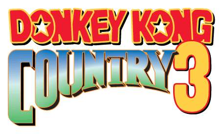
I can't seem to find the 2 fonts in DKC logo. I've searched, but all I find is that stupid "Kongtext Regular". :x What's so great about it? There's millions of fonts that look very similar to it, plus it's not a unique font at all. Anyway, the one I want the most is the "Donkey Kong" part. The closest font to it I can find is Porky's, and the difference is that the letters are curved, it doesn't have those stars in the middle of the Os, it's thinner, and it doesn't have an outline. The "Country" part is roughly a stencil font, so there's fonts that look basically the same, but not close (The closest one I found is "Cargo Crate") Does anyone know where these fonts (Or more similar ones) are?

Image


Edit by Qyzbud: This topic is for discussing, discovering and distributing any fonts used in the DKC games.

One of our top data detectives — Mattrizzle — has tracked down the following font:

Gill Sans Ultra Bold Condensed.7z
Used for various in-game graphical background text
(45.32 KiB) Downloaded 2643 times


Some screenshots showing this font's use in-game:
Spoiler!
Image


Newcomer 8290853 has brought the following font to our attention:

jumpman.zip
A likeness of the Donkey Kong title text, by Pixel Sagas
(14.21 KiB) Downloaded 1980 times


An example of this font used to roughly replicate the D✪NKEY K✪NG title:
Spoiler!
Image

Re: DKC Fonts

PostPosted: March 22nd, 2008, 12:33 pm
by Blaziken257
"Kongtext" is actually the font used in the SNES versions of the game. You see it when you talk to non-playable characters like Candy, Cranky, Funky, Swanky, etc. You will also see it in DKC1 with the level names and a few other places. The difference with the Kongtext font is that it lacks an outline. Otherwise, it's the exact same font. I happen to like the font a lot; it's one of my favorite video game fonts ever. (Well, I like a LOT of fixed-width fonts actually...) I like it so much that I use it in a lot of my YouTube videos...

EDIT: Er... sorry, I don't know where any other fonts are. If I knew how to make fonts, I could make them...

Re: DKC Fonts

PostPosted: March 23rd, 2008, 11:36 pm
by Qyzbud
Kong-Fu, why not edit this into your above post as a visual reminder...

dkc3_logo.png (Edit: as seen above)

As for other fonts, I must admit I haven't found anything like what you're asking for. Cyclone is working on a title text modeling project, but that's another story entirely. I too would like to have those fonts (or similar) for design work, especially for titling and text labels for my maps. Below are the most relevant fonts I've found, although they really aren't that well matched...

ImageImage

If I do manage to turn up anything useful, I'll post my findings here.

Re: DKC Fonts

PostPosted: March 23rd, 2008, 11:58 pm
by cfh
Ran it through WhatTheFont but didn't find anything...

Re: DKC Fonts

PostPosted: March 26th, 2008, 3:04 am
by BlueTronic
Mute Fruit looks very similar to the "Country" part, but it's too curved and doesn't doesn't have that Times New Roman effect on the tips of the letters.

Re: DKC Fonts

PostPosted: March 26th, 2008, 12:37 pm
by Qyzbud
I think Cargo Crate was a closer match. Mute Fruit's only similarity is the stencil breaks... and if you think about it, the Country text really isn't in a stencil font at all; it just has a break in a few letters (less than half). I really have no idea why it even has those breaks.

When you mentioned the stencil style, and specifically the Cargo Crate font, I began to think of the way different labels are sprayed onto the side of crates using a stencil. This fits the animal crate concept nicely (the decals on those crates look to be stencilled on), and the idea of cargo being washed up on shore, or dropped from a low-flying plane onto DK Island is something I've always considered. Maybe this concept lead to the choice of logo font.

I'm pretty sure the blue-white-green gradient is hinting at sky-horizon-jungle (as seen in level 1), and the orange 'contour' lines on Country are symbolic of the wireframe mesh used to construct the game's pre-rendered 3D graphics. Of course, the Donkey Kong font is a replica of the DK Arcade title, but why it was used there, I don't know. Looks like a 'circus' type of font to me. Maybe that's where Cranky (then DK) came from... :P

Re: DKC 3D Modeling/Animation Project

PostPosted: January 31st, 2013, 11:22 am
by Phyreburnz
Qyzbud writes: The following posts were merged to this topic from Cyclone's DKC 3D Modeling/Animation Project (view this post to see where the discussion began)
We were aiming to work out which font was used for the 'KONG RADIALS' text on the tires:
Spoiler!
Image

- -- — -- -

This site will probably be helpful in finding a font! You can type in test text. The font "That's All Folks" is similar, as well.

http://www.myfonts.com/fonts/comicraft/thats-all-folks/

*EDIT* I'm looking for more fonts. "Foo" is similar:

http://www.myfonts.com/fonts/typodermic/foo/

I think "Foo" is the closest I've found.

Re: DKC 3D Modeling/Animation Project

PostPosted: January 31st, 2013, 12:30 pm
by Qyzbud
Thanks for the link — that site is excellent!

I can't believe how many similar typefaces there are to the one we're looking for... unfortunately pretty much all of them have diamond or triangle shapes for the bar in 'A's — like Showcard Gothic does.

Foo is an excellent match, but it too has the diamonds in the 'A's... El Grande has a regular 'A' bar, but is perhaps too heavy?

It looks like we're looking for a bold, top-heavy, 'showcard' font, circa 1920 — 1950...

Re: DKC 3D Modeling/Animation Project

PostPosted: January 31st, 2013, 2:29 pm
by Cyclone
This is the tire with the "Showcard Gothic" font and a revised tire animation. The font is a little thick though...

Image


Re: DKC 3D Modeling/Animation Project

PostPosted: January 31st, 2013, 2:30 pm
by Mattrizzle
i don't think it's necessary for the font to be top-heavy. It looks that way because of how it is deformed on the tire.

The font in question appears to be used in several places within the first two DKC games. Here are all of the instances I could find (click the spoiler to view them):
Spoiler!
that_font.png

The first 'a' on the Cranky's Cabin sign looks strange, though, probably because an artist had to retrace it to make it more readable. That, or someone misspelled Cranky's name "Cronky." :shock:

Re: DKC 3D Modeling/Animation Project

PostPosted: January 31st, 2013, 3:07 pm
by Qyzbud
You might be right about the deformation — it could well be the same font as in those other spots... I thought of that, but the effect was so pronounced (without looking accidental) on the tire's text, that I figured it was a characteristic of the typeface itself...

I would still love to see how Passion and Foo would look in place of Showcard Gothic. :)

The animation is a step in the right direction, Cyclone — keep it up! :D

Re: DKC 3D Modeling/Animation Project

PostPosted: February 1st, 2013, 4:32 am
by Mattrizzle
I think I've found the font! It's either Gill Sans Ultra Bold or Gill Sans Ultra Bold Condensed. Unfortunately, they aren't free, but you most likely have them if you have Microsoft Office on your computer.

EDIT: You need Office 2010 or 2013 for the font.

Re: DKC 3D Modeling/Animation Project

PostPosted: February 1st, 2013, 5:48 am
by Simion32
No, it's not here. Office 2007.

Yeah, and 30 dollars for a typeface? Screw you Gill.
!@#$ proprietary crap always getting in the way of everything. GRRRRRR

Re: DKC 3D Modeling/Animation Project

PostPosted: February 1st, 2013, 7:14 am
by VideoViking
No need. I got it.

Re: DKC 3D Modeling/Animation Project

PostPosted: February 1st, 2013, 11:38 am
by Qyzbud
Yep — that's the one, Matt! I believe the 'condensed' version is the one Rare used.

I got it for free here, but I'm sure it's up for grabs at no charge elsewhere, too.

Top work, guys. :D

I'll move this discussion to the DKC Fonts topic at next opportunity, and will attach the fonts we have identified to to original post.

Re: DKC 3D Modeling/Animation Project

PostPosted: February 1st, 2013, 11:45 am
by Cyclone
Yea just found it here for free

http://www.fontpalace.com/font-download ... ltra+Bold/

thanks. I will post it on the tire in a few min.

Edit - It doesn't appear to be the same font? The holes in the letters should be bigger.

Gill Sans Ultra Bold
Tire6.png
Tire6.png (312.8 KiB) Viewed 57821 times

Re: DKC 3D Modeling/Animation Project

PostPosted: February 1st, 2013, 1:54 pm
by Phyreburnz
I don't think Gill Sans is what they used at all... for the tire, that is. The holes in the "o" aren't down toward the bottom like the original, they're in the center. Also, the letters aren't "pulled down" like the original (like how the letters taper down toward the bottom).

I still think that Foo, Passion, and Showcard Gothic are closer.

Re: DKC 3D Modeling/Animation Project

PostPosted: February 1st, 2013, 2:37 pm
by Mattrizzle
I beg to differ.
kong_radials_gsubc_deformation.png
kong_radials_gsubc_deformation.png (16.18 KiB) Viewed 57811 times

Vertically stretching the top half of the text can make a world of difference. Also, try using the condensed version of the font, at 75% width.

But eh, if Cyclone can't duplicate this technique with the 3D software he uses, Showcard Gothic wouldn't be a bad substitute...

Re: DKC 3D Modeling/Animation Project

PostPosted: February 1st, 2013, 3:03 pm
by VideoViking
I think the font used in DKC is a customized version of Gill Sans. Fonts can be copyrighted, so maybe the folks at Nintendo couldn't use the true font due to licensing issues.

Best way to determine that: match which letters in the database are equal. Does the ROM store the complete font library, Mattrizzle?

Re: DKC 3D Modeling/Animation Project

PostPosted: February 1st, 2013, 4:48 pm
by Tonberry2000
Mattrizzle is like some kind of fangaming Batman. He shows up everywhere, helps out, and then disappears without making a big deal. What a cool guy.

Re: DKC 3D Modeling/Animation Project

PostPosted: February 1st, 2013, 6:28 pm
by Qyzbud
I couldn't agree more, Tonberry. :D

Re: DKC 3D Modeling/Animation Project

PostPosted: February 2nd, 2013, 3:56 am
by Phyreburnz
Ahhh! I see it now. Just regular, it doesn't look like the tire text at all, but when you do that, it's identical.

Re: DKC Fonts

PostPosted: February 2nd, 2013, 11:37 am
by Simion32
To get this right Cyclone may need to place each letter *individually* on the tire instead of rotating a text string around the tire.

Re: DKC Fonts

PostPosted: September 26th, 2013, 9:12 am
by 8290853
The font you are looking for is called Jumpman

Re: DKC Fonts

PostPosted: September 26th, 2013, 10:18 am
by VideoViking
Here's a preview of Jumpman: http://www.dafont.com/jumpman.font

Re: DKC Fonts

PostPosted: September 26th, 2013, 9:09 pm
by Simion32
No, it's not.

Gill Sans is the font that's on the tire.

Jumpman is *a variant of* what's used in the "Donkey Kong" part of the DKC Logo.

Re: DKC Fonts

PostPosted: September 27th, 2013, 12:39 am
by Qyzbud
Actually, Simion, the main request of this topic was indeed the one 8290853 posted:

I can't seem to find the 2 fonts in DKC logo.
...the one I want the most is the "Donkey Kong" part.


Title text for reference:
Image

Rough approximation created with the "Jumpman" font:
donkey-kong-title-jumpman-font.png
donkey-kong-title-jumpman-font.png (108.12 KiB) Viewed 57129 times


So it would seem to me that Jumpman is exactly what was asked for — thanks, 8290853! :banana:

I'll add this new discovery to the original post. :)

Re: DKC Fonts

PostPosted: September 27th, 2013, 3:41 am
by Simion32
Ooops, sorry. I didn't bother to read the original post again. :facepalm:

The funny thing is, I actually already had that font for several months now. :P